Attributes
The component includes a lot of different attributes, the most common ones are as follows:
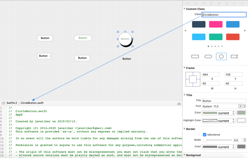
Class Name
You can change the component's class name to what you want. Changing the class name will update the class name in the Code View synchronously.
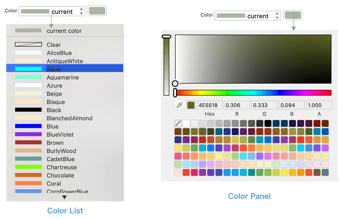
Color
Color attributes include text color, fill color, highlight color, etc. It can be selected from the drop-down list or from the color panel.
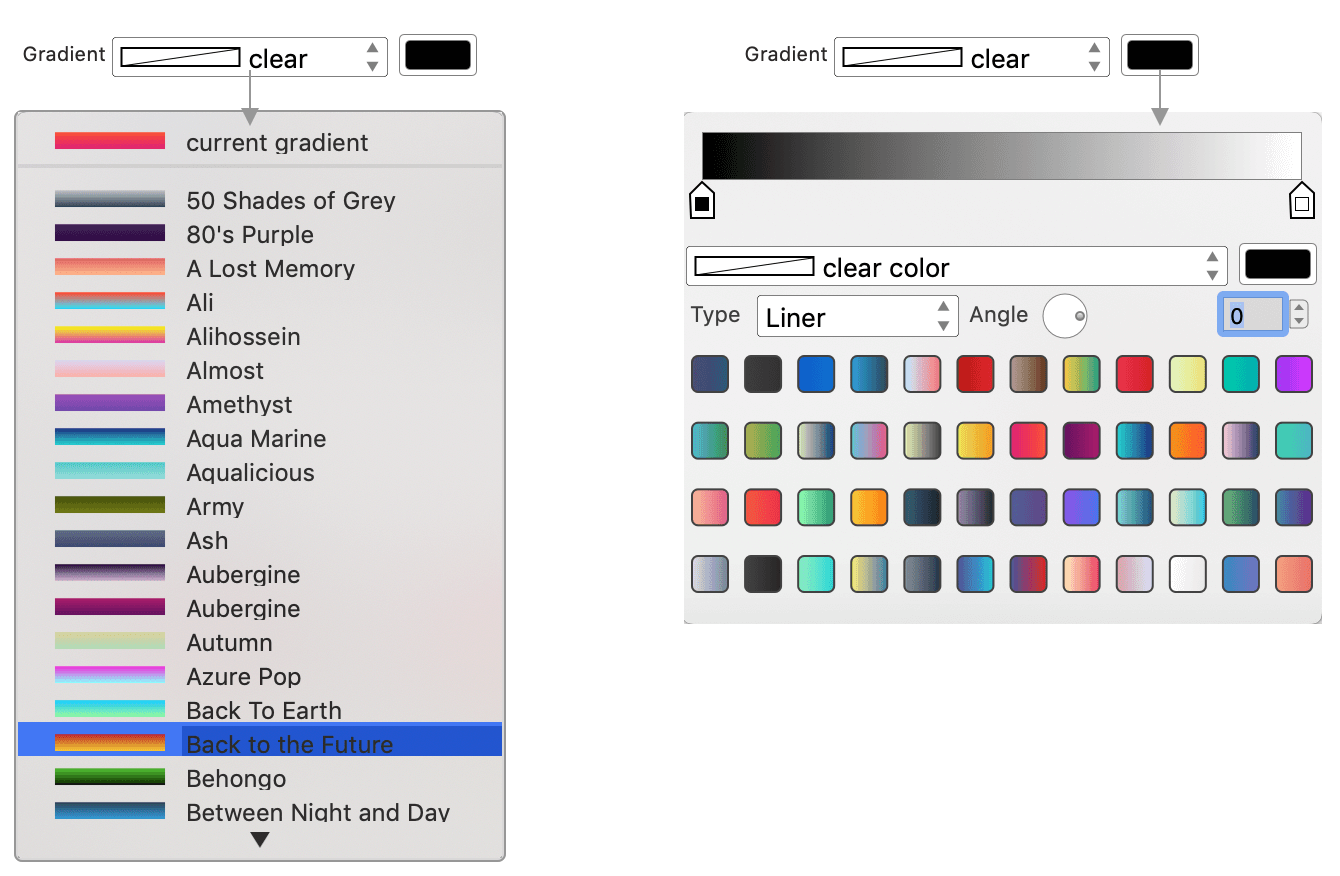
Gradient
Gradient attributes include fill gradient, highlight gradient, etc. It can also be selected from the drop-down list or from the panel.
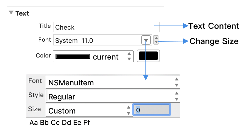
Text
In general, text/title item includes content, fonts, and colors.
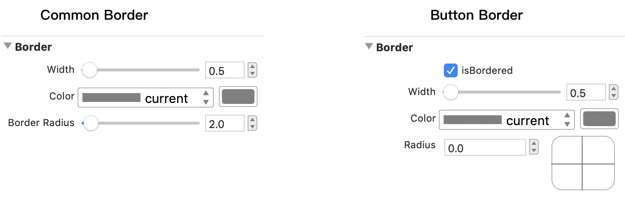
Border
Width, color, radis are the common properties of border. But for the button we can also set the four corners of the radis.
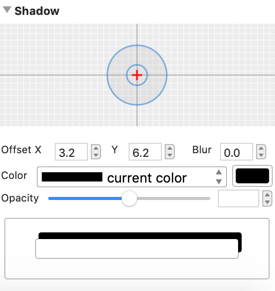
Shadow
Currently only button and view support shadow properties.